Material Design Icons as Vue Single File Components
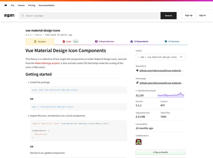
The Vue Material Design Icon Components library is a fantastic addition for developers using Vue.js who want to incorporate Material Design icons seamlessly. This collection consists of single-file components designed to make using icons straightforward while ensuring that they are visually consistent with the Material Design principles. With built-in CSS to help scale the icons to match surrounding text, this library simplifies icon integration into your Vue projects.
The setup process is user-friendly, allowing for both local and global declarations of icons. This flexibility, combined with accessibility features and customizable properties, makes it a strong choice for those looking to enhance their applications with clear and attractive iconography.
fillColor prop allows you to modify an icon’s color programmatically, making it easy to adapt icons without diving into CSS.size prop, or use CSS for more tailored sizes if preferred.