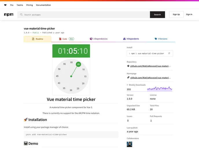
A material time picker component for Vue 3.
Overview
The Time Picker component is a versatile tool designed to simplify the process of selecting time within applications. With its user-friendly interface and ample customization options, it aims to cater to a wide range of user preferences. This component seamlessly integrates with any application and offers intuitive controls, making it an excellent choice for developers seeking to enhance user experience in time selection.
In addition to standard functionalities, it provides various features that accommodate diverse use cases—from casual time picking to more precise selections involving seconds. The ability to customize aspects such as width, color, and interactivity opens the door for a more tailored solution that meets specific design requirements.
Features
- Standard Input: Accepts time in HH:mm:ss format or as a Date object for flexibility in how users input their selections.
- Disabled Option: Render the component non-interactive by using the disabled prop, keeping your UI clean when not needed.
- Read-Only Mode: Similar to the disabled prop but retains the visible styling, allowing for a clear indication that the time is not editable.
- Seconds Selection: An optional feature that includes a step for selecting seconds, catering to scenarios where precision is essential.
- Automatic Transition: Automatically advances the selection process, helping streamline the user experience by reducing unnecessary clicks.
- Customizable Width: Set the width of the component to fit your design needs, with easy input options including strings or numbers.
- Full-Width Option: An override that allows the picker to use 100% of its parent container’s width, ensuring consistency in responsive designs.
- Color Customization: Control the visual elements with a color prop that adjusts the title and clock hand to match your application’s aesthetic.
