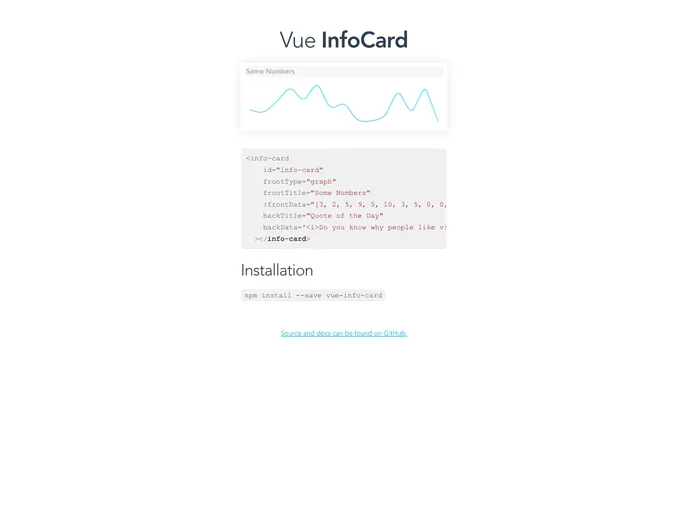
Simple and beautiful card component with an elegant spark line, for VueJS.
The Vue Info Card component is a versatile and visually appealing way to display data in a compact format. Its unique flip effect adds an interactive touch, making it easy for users to view additional information with a simple click. This component is ideal for dashboards or any area where data presentation is key, allowing for brief summaries or detailed information to be represented in an engaging manner.
Integration is straightforward, requiring a simple installation via npm, followed by customization through props to tailor the card to your needs. The card can be configured to show different types of information, from textual data to dynamic graphs, making it suitable for various applications.
Customizable Front and Back: Define both front and back faces of the card with distinct types, titles, and data, allowing for a tailored user experience.
Support for Graphs or Text: Each face can display data as either a graph or text, accommodating different content types depending on your requirements.
Interactive Flip Effect: Users can easily flip the card to view additional information, enhancing engagement without cluttering the interface.
Dynamic Data Input: The card can display strings or arrays, providing flexibility in how data is presented; arrays can be used for graphs while strings work for text.
Gradient Customization: Utilize customizable gradient colors for the spark lines, adding a modern aesthetic that matches your application’s branding.
HTML Compatibility: Both front and back data props accept HTML, enabling the inclusion of rich content such as links, formatting, and additional elements directly in the card body.
Easy Installation: Setup is quick and simple with npm, allowing developers to get started in no time with minimal overhead.