Overview
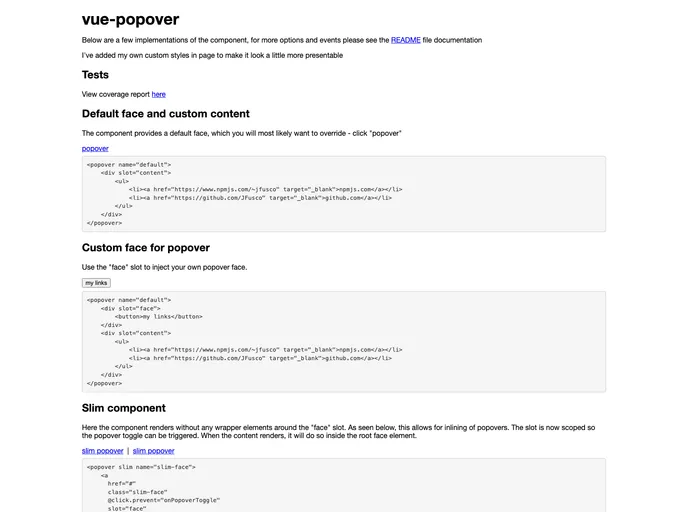
Vue-Popover is a flexible and reusable popover component designed for Vue.js applications. This component stands out due to its minimalist design, offering developers a blank canvas without predefined styles, which provides the freedom to create unique customizations. With simple installation and usage instructions, Vue-Popover is perfect for those looking to enhance their user interface with an interactive element while maintaining full control over the styling aspects.
Features
- Lightweight Design: The component is purely functional with no built-in styles except a basic z-index, allowing for extensive customization.
- Custom ID: Requires a unique ID string for each instance, facilitating the setting of accessibility attributes.
- Event Hooks: Offers optional functions for triggering events when the popover opens or closes, improving interactivity.
- Content Flexibility: Supports slots for customizable content and UI elements within the popover, making it highly adaptable for various use cases.
- Content Click Handling: Optionally allows the popover to remain open when interacting with its content, enhancing usability for forms and buttons.
- Slim Mode: Enables a leaner version of the popover, requiring the “face” slot and omitting additional wrappers for a cleaner look.
- Styling Options: Provides SCSS files for easy integration into projects, with the choice of overriding variables or using minified styles for quick implementation.