An area-linkage-component bases on Vue and iView-UI components
If you’re developing a web application using the Vue framework, you might find yourself in need of a powerful and flexible city cascader component. The iview-area is a city-level cascader that elegantly integrates with the iView UI component library and provides a comprehensive dataset of Chinese provinces, cities, districts, and towns. This component simplifies the user experience by allowing users to make selections in a structured manner, significantly enhancing the interactivity of your applications.
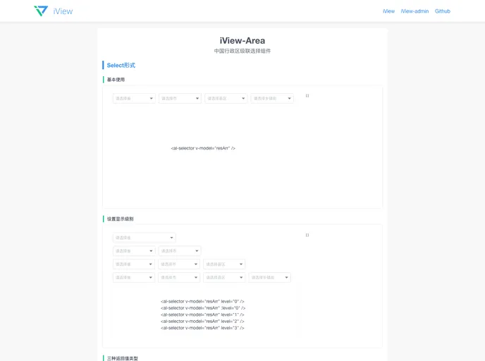
This dynamic component not only supports a dropdown menu selection based on the iView Select component but also features a cascader selection using the iView Cascader component. Whether you need users to navigate through China’s hierarchical administrative divisions or want to implement a clean UI for selecting locations, the iview-area component fits the bill perfectly.
Dynamic Cascading: Offers two types of cascader forms: a dropdown menu and a complete cascader. This versatility allows for better integration within different UI layouts.
Comprehensive Data: Access to a detailed dataset including all provinces, cities, counties, and towns in China helps provide users with relevant location options effortlessly.
Configurable Options: Customize the component using options such as the level, which specifies how many levels to display, and size, which adapts the appearance to fit within your design.
Searchable Functionality: Users can search through the options by enabling the searchable attribute, enhancing ease of use in selecting specific locations.
Automatic Selection: The auto property allows for automatic selection of subsequent levels when the user picks an initial category, streamlining the selection process.
Detailed Placeholder Text: Customizable placeholder texts for each level give guidance to users about what to select next, making the component more intuitive.
Disabled Selection Options: You can easily disable the entire cascader or specific levels, allowing for more control over user interactions based on the context.
Robust Event Handling: The on-change event callback ensures that developers can capture and respond to user selections dynamically, returning an array of selected values for further processing.