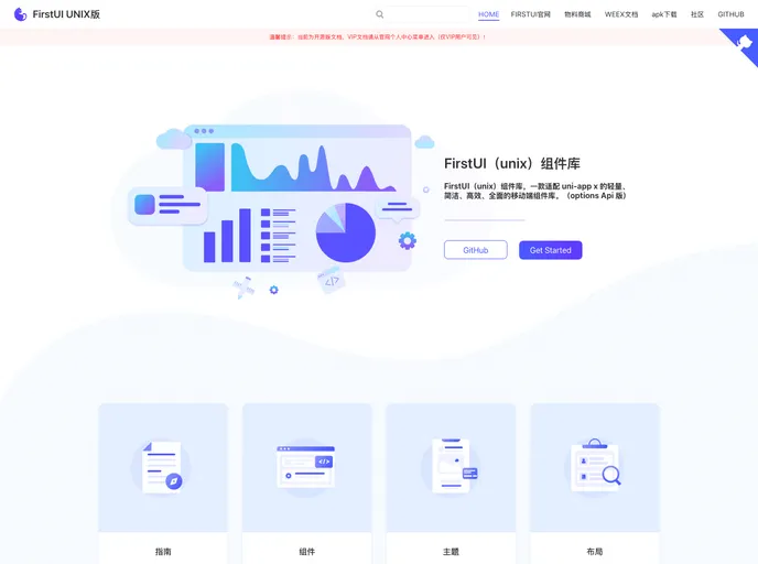
FirstUI(unix)组件库,一款适配 uni-app x 的轻量、简洁、高效、全面的移动端组件库。(FirstUI (unix) component library is a lightweight, concise, efficient, and comprehensive mobile component library that is compatible with uni app x.)
Overview
FirstUI is a lightweight, efficient, and comprehensive component library designed specifically for the mobile web, compatible with the uni-app x framework. It stands out due to its simplicity and effectiveness, making it an excellent choice for developers looking to enhance their mobile applications with a variety of ready-to-use components. With FirstUI, users can quickly get started by either installing it via npm or downloading the necessary files directly into their projects.
As a developer, the streamlined implementation process is particularly appealing. Whether you are adding simple buttons or more complex components like modals and sliders, FirstUI’s intuitive API allows for easy integration into your existing codebase, ensuring that your app remains responsive and user-friendly.
Features
- Comprehensive Component Set: Offers a wide range of components including buttons, forms, modals, and more, catering to various needs in mobile app development.
- Easy Installation: Can be installed through npm or by downloading the specific components directly into your project, making setup flexible and straightforward.
- Form Handling Capabilities: Includes enhanced form components with validation support, allowing for easy data collection and processing in your applications.
- Regular Updates: Frequently updated with new components and optimizations to enhance performance and ensure compatibility, particularly with iOS.
- Optimized for Mobile: Each component is designed to work seamlessly across various mobile platforms, ensuring an excellent user experience regardless of the device used.
- Support for Interactive Elements: The library includes interactive components like sliders, switches, and dropdowns that engage users effectively and improve app usability.
- Extensive Documentation: Provides comprehensive guides and examples for each component, making it easy for developers to get assistance when needed.
- Customization Options: Many components come with customizable properties allowing developers to tailor the appearance and functionality according to their app’s design.