Overview
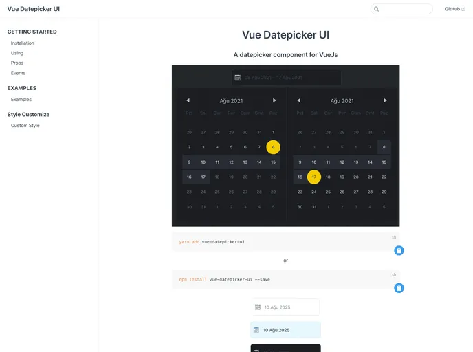
The Vue Datepicker Component is a versatile and user-friendly tool designed specifically for Vue.js applications. It offers a smooth integration with both Vue 2.x and Vue 3.x, making it an ideal choice for developers looking to enhance their projects with date selection functionality. This component not only supports a range of date formats but also allows for customizations to suit various requirements.
With its clean design and multiple features, the Vue Datepicker Component ensures a seamless user experience. Whether you need a basic date picker or a more complex range selector, this component is flexible enough to accommodate both. Its ability to handle multiple languages and customizable options makes it a standout choice for developers.
Features
- Flexible Date Selection: Supports single dates or date ranges with a simple object structure.
- Language Support: Easily customize the language using ISO codes to reach a broader audience.
- Customizable First Day: Choose between Monday or Sunday as the starting day of the week, catering to regional preferences.
- Input Styling: Add custom classes to style the input field, ensuring it fits seamlessly with your design.
- Date Range Restrictions: Control the start and end dates for selection to prevent invalid dates from being chosen.
- Format Options: Use a variety of formats for displaying the date, making it adaptable to user needs.
- Clear Date Functionality: Optional clear button allows users to easily reset their selection with a single click.
- Initial Picker Display: Decide whether to show the date picker when the component is first mounted, enhancing user interaction.